Marinez J.
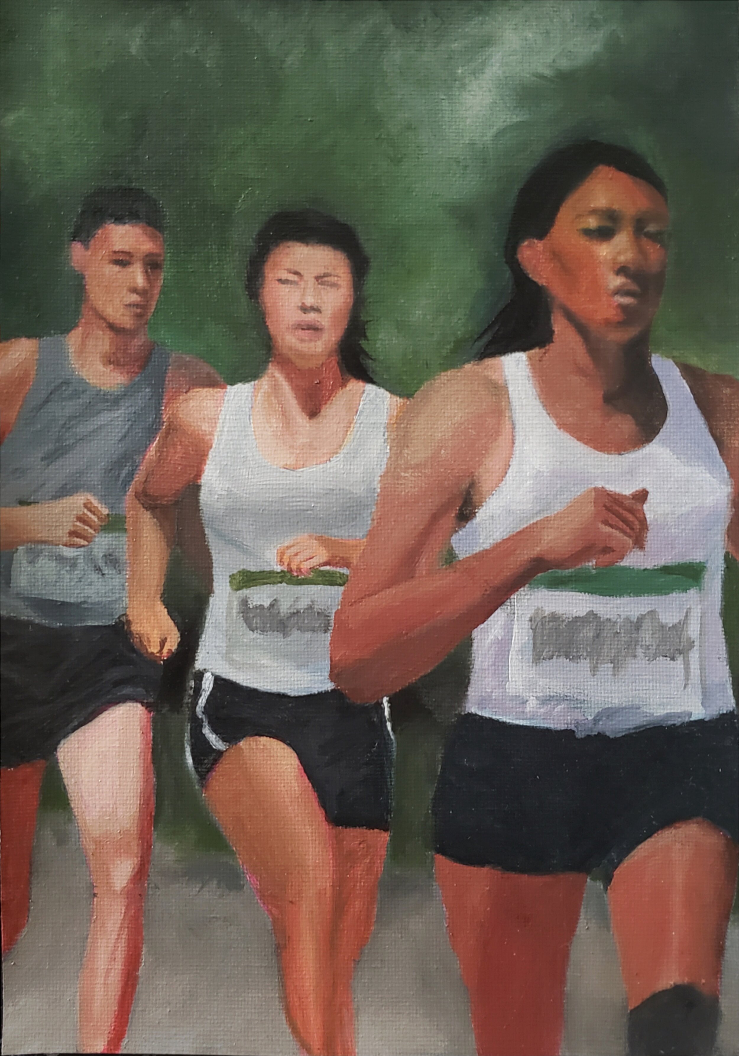
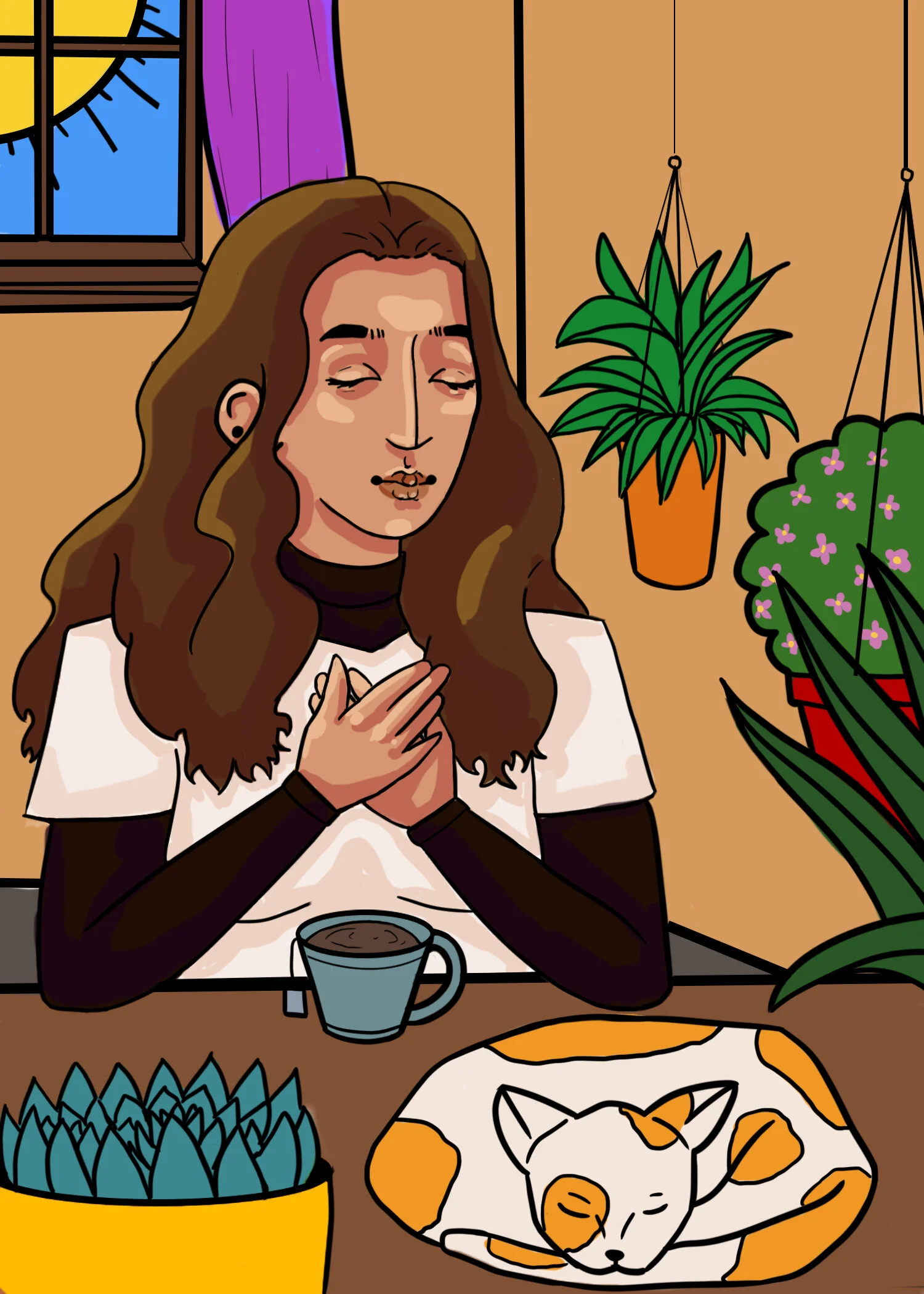
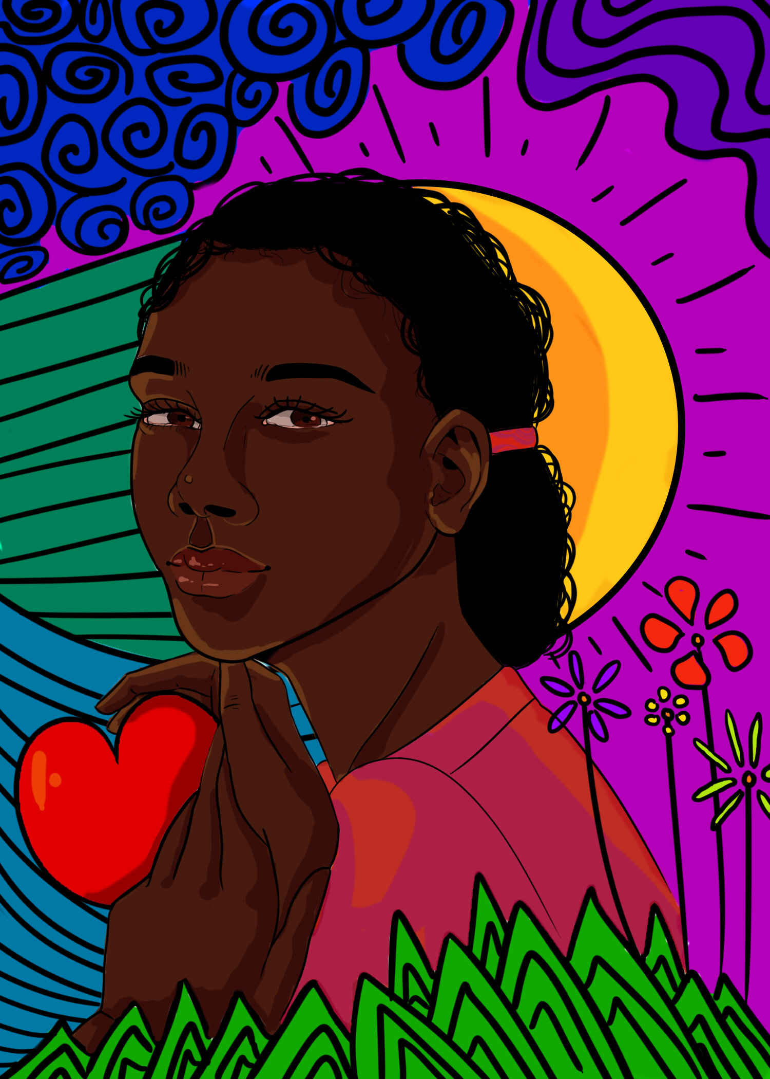
I wanted to prioritize creating an atmosphere. I wanted to get across the air of strength and perseverance for my resilience card.

J. Casiano
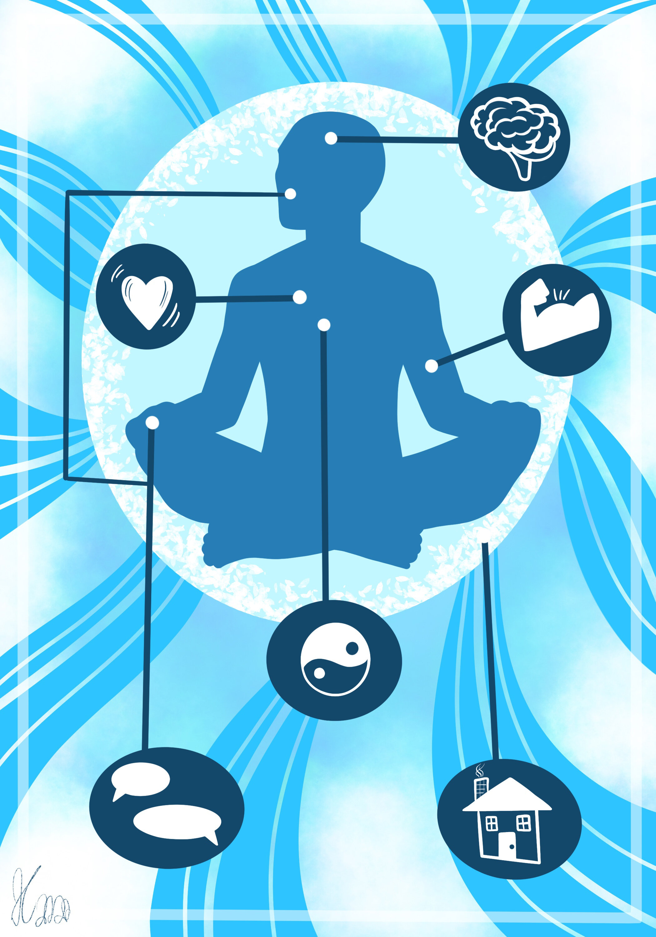
For these cards, I wanted to create monochromatic pieces with elements of patterns and graphic designs that represented light exposure and creating a self-care plan. Self-care is something I think is very important and should be depicted more often in art. I was happy to help and contribute to this project.

Marinez J.
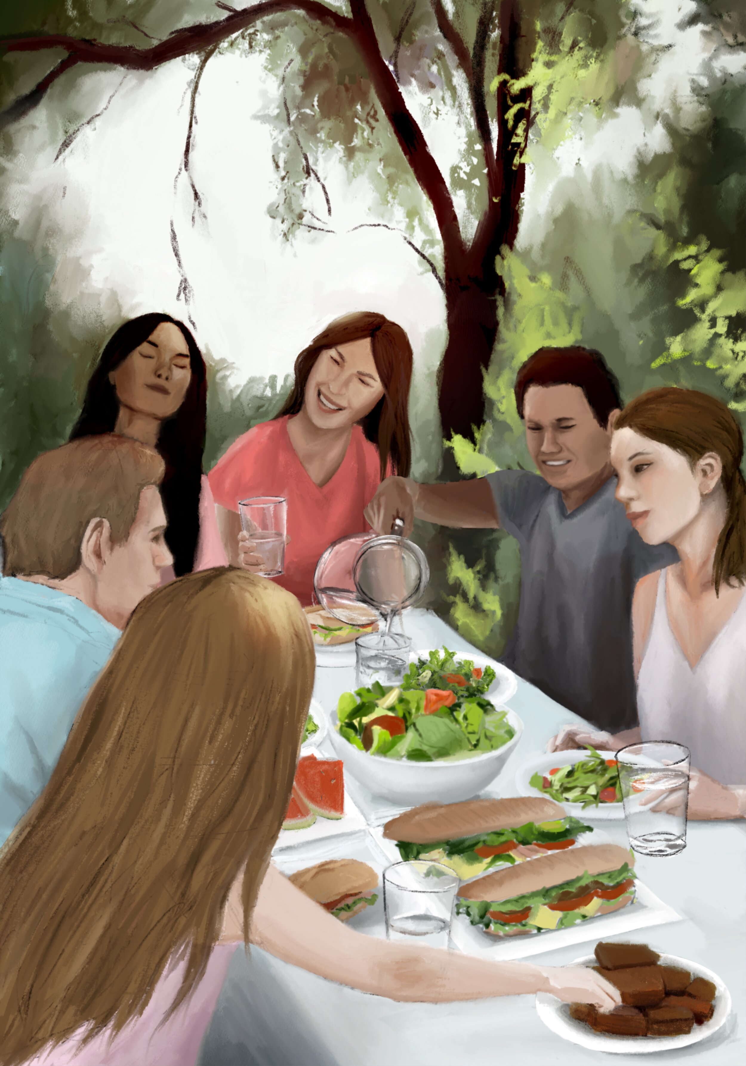
I wanted to prioritize creating an atmosphere. I wanted to create an air of enjoyment and goodness in association with food and healthy eating.

Kimora C.
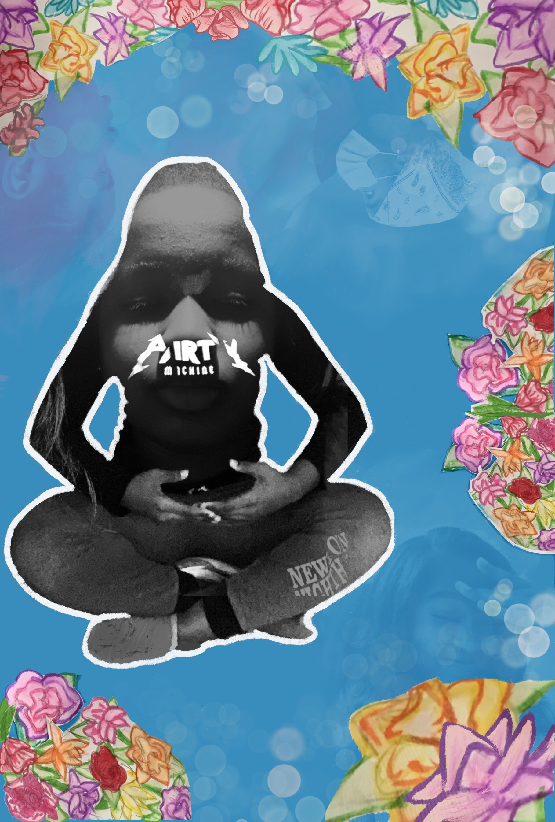
I thought about what I've seen that mainly expresses ways to relieve stress. I also included faded expressions of myself as to not limit relieving stress to just one activity. I used procreate in my work, and comments from my peers helped me achieve this final product.

Ellie C.
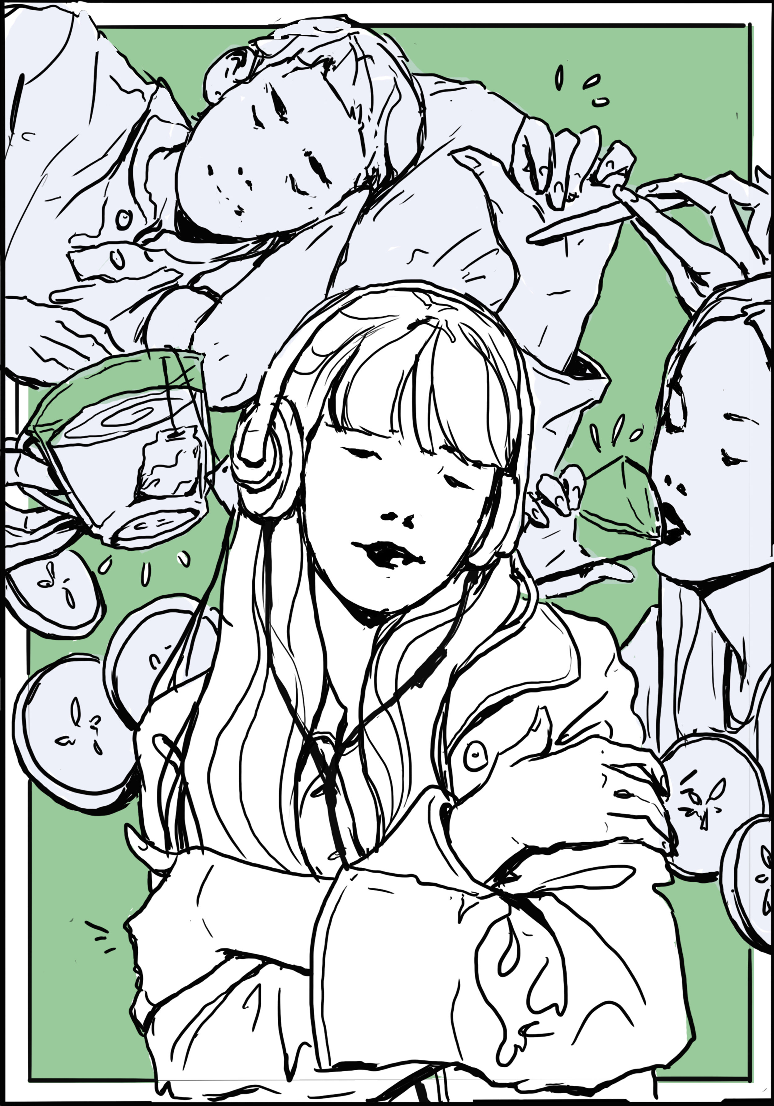
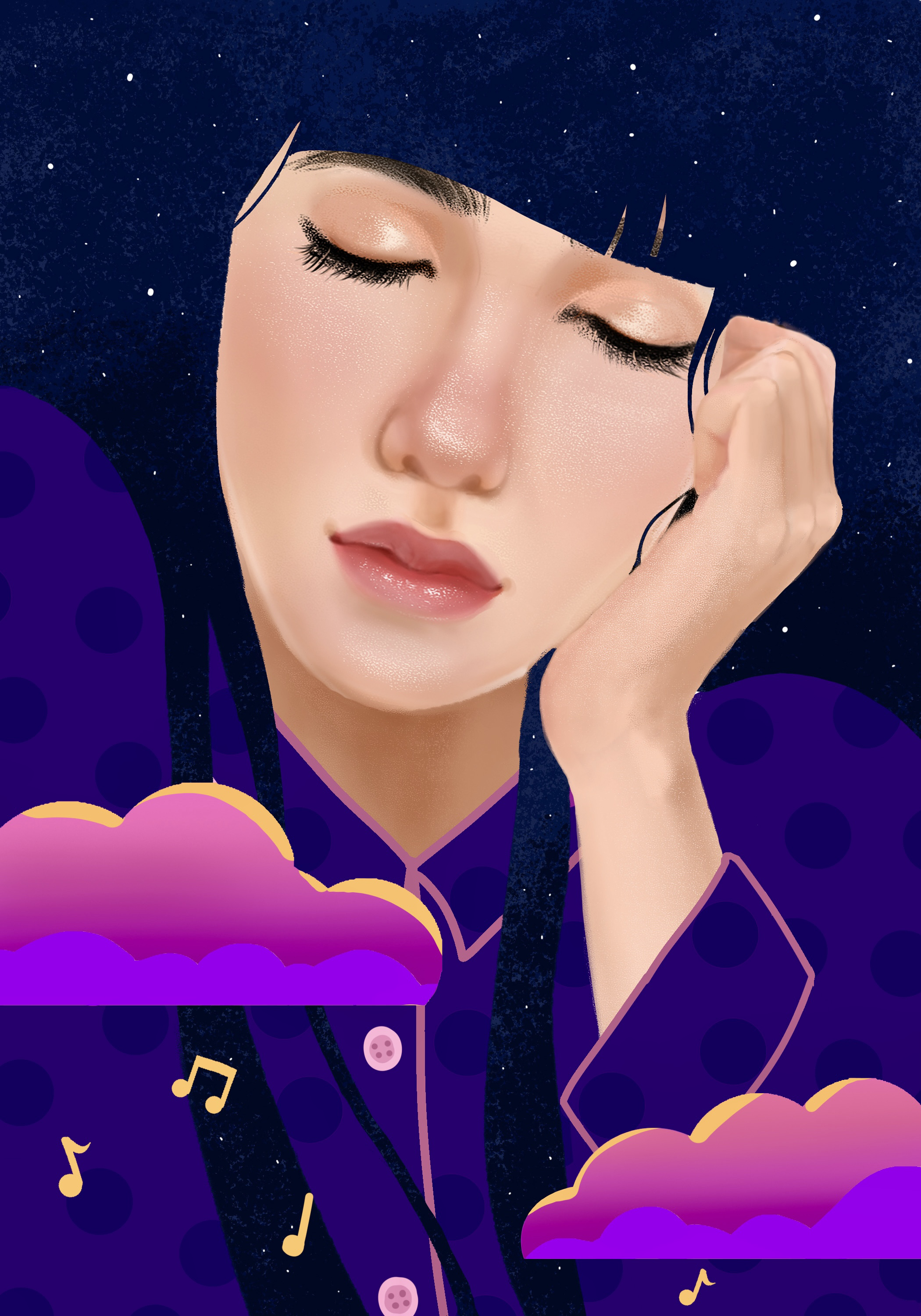
For my pieces, I wanted to emphasize the feeling of comfort. For self-care, I wanted to showcase different ways to care for yourself, from listening to music to drinking water to giving yourself a hug, and look at how they can all intersect with each other. Done in photoshop.

Siobhan E.
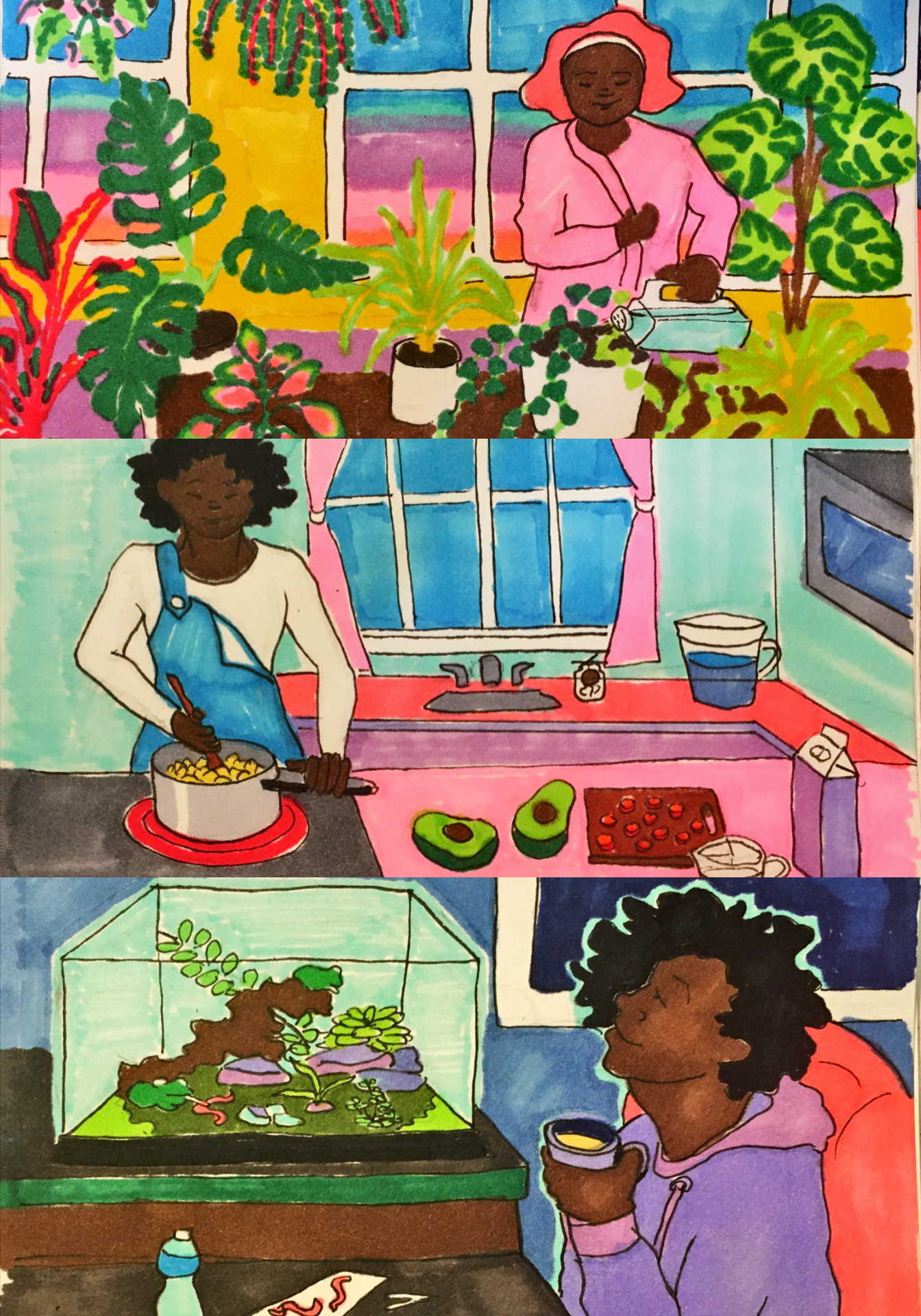
I decided to depict healthy habits that make me feel better when my routines start to break down, especially nourishing myself and those who depend on me. My illustration was in everblend marker and micron pen.

Ellie C.
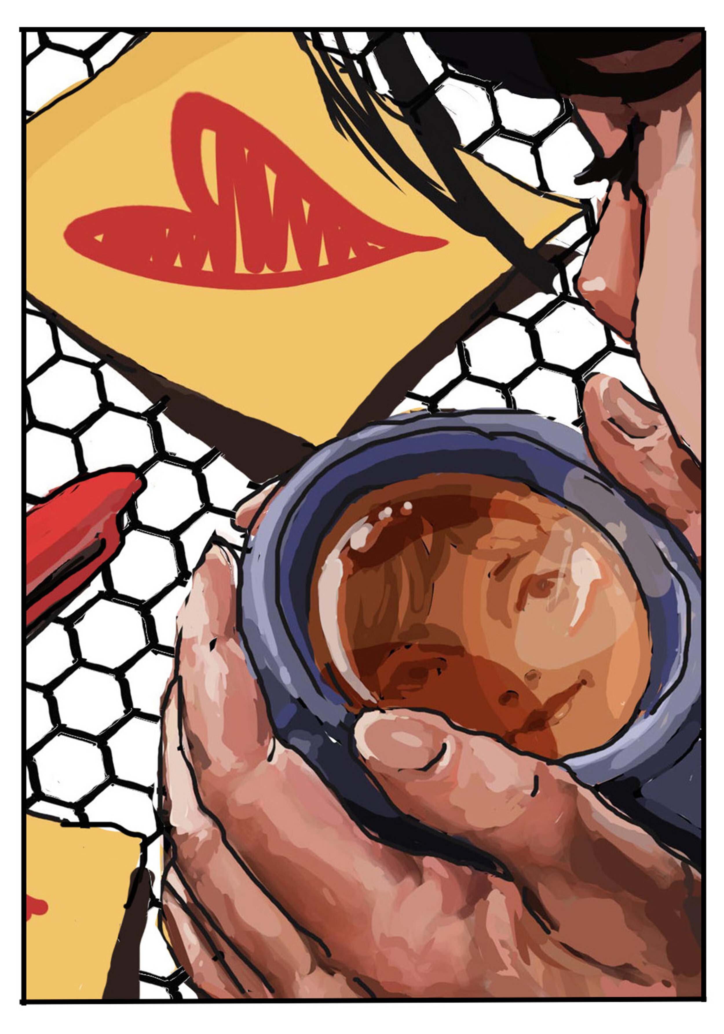
For my pieces, I wanted to emphasize the feeling of comfort. For daily emotional check-in, I wanted to look at a more quiet form of reflection: looking into a cup of tea. I think that it’s a lovely moment, and I wanted to use my colors to emphasize feelings of warmth and happiness (even though all other emotions are okay too!). Done in photoshop.

Liz S.
Theme: taking self-compassion breaks

J. Casiano
For these cards, I wanted to create monochromatic pieces with elements of patterns and graphic designs that represented light exposure and creating a self-care plan. Self-care is something I think is very important and should be depicted more often in art. I was happy to help and contribute to this project.

Natalie W.
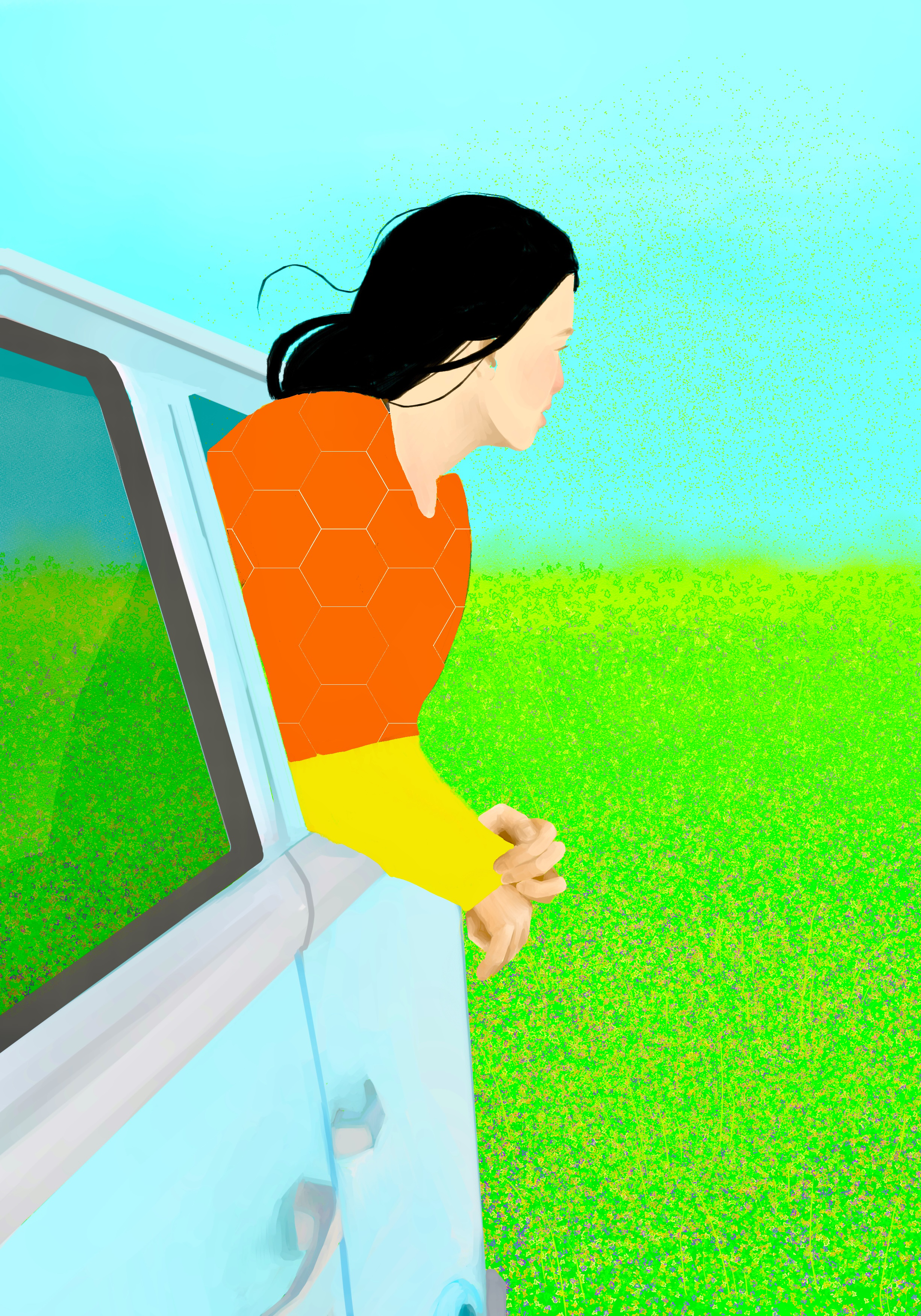
The ideas for these cards were based on feelings of comfort and energy and colors that I believe related to the prompts. Visually, I wanted it to be bold as well as give my subjects character through the shapes I put together.

Natalie W.
The ideas for these cards were based on feelings of comfort and energy and colors that I believe related to the prompts. Visually, I wanted it to be bold as well as give my subjects character through the shapes I put together.

Liz S.
Theme: good will

Leah V.
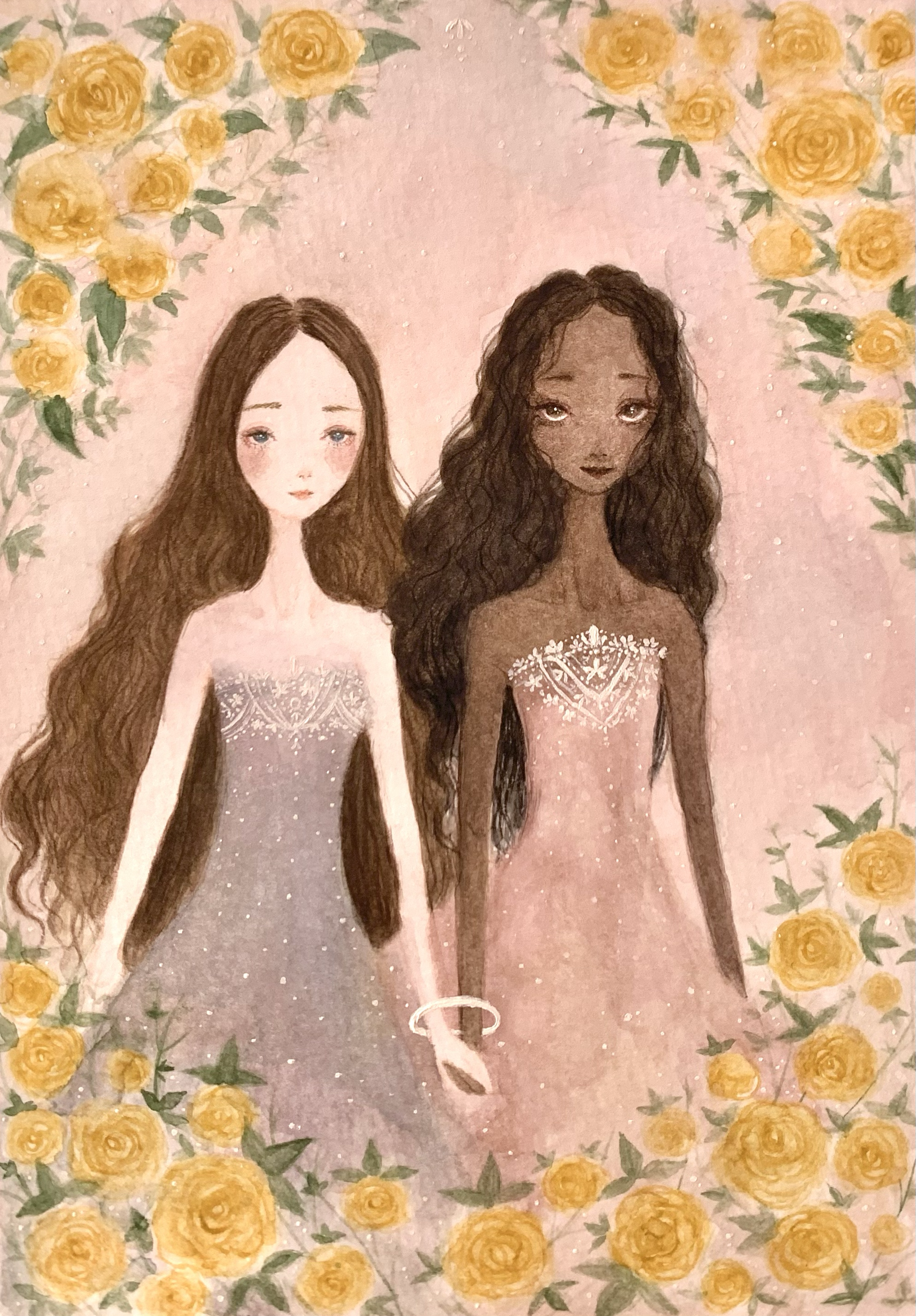
With the idea of building positive relationships in mind, it made me think of there being a harmony between diverse people. Inspired by the racial justice movements, I wanted to draw two people of separate races holding hands. This signals that they accept each other despite their differences that keep their communities and cultures apart. Like my other work, I wanted my piece to capture a peaceful and beautiful sort of energy that makes the viewer feel happy. The yellow Roses represent friendship and life. Watercolor and acrylic paint.
